Problem Statement:
The existing Classic Car Landing Page lacked a contemporary look and user-friendly structure. It suffered from low conversion rates and limited organic traffic due to poor search engine optimization. The goal was to revamp the page's design, create an intuitive layout, and improve SEO to attract more visitors and potential buyers.
The Process
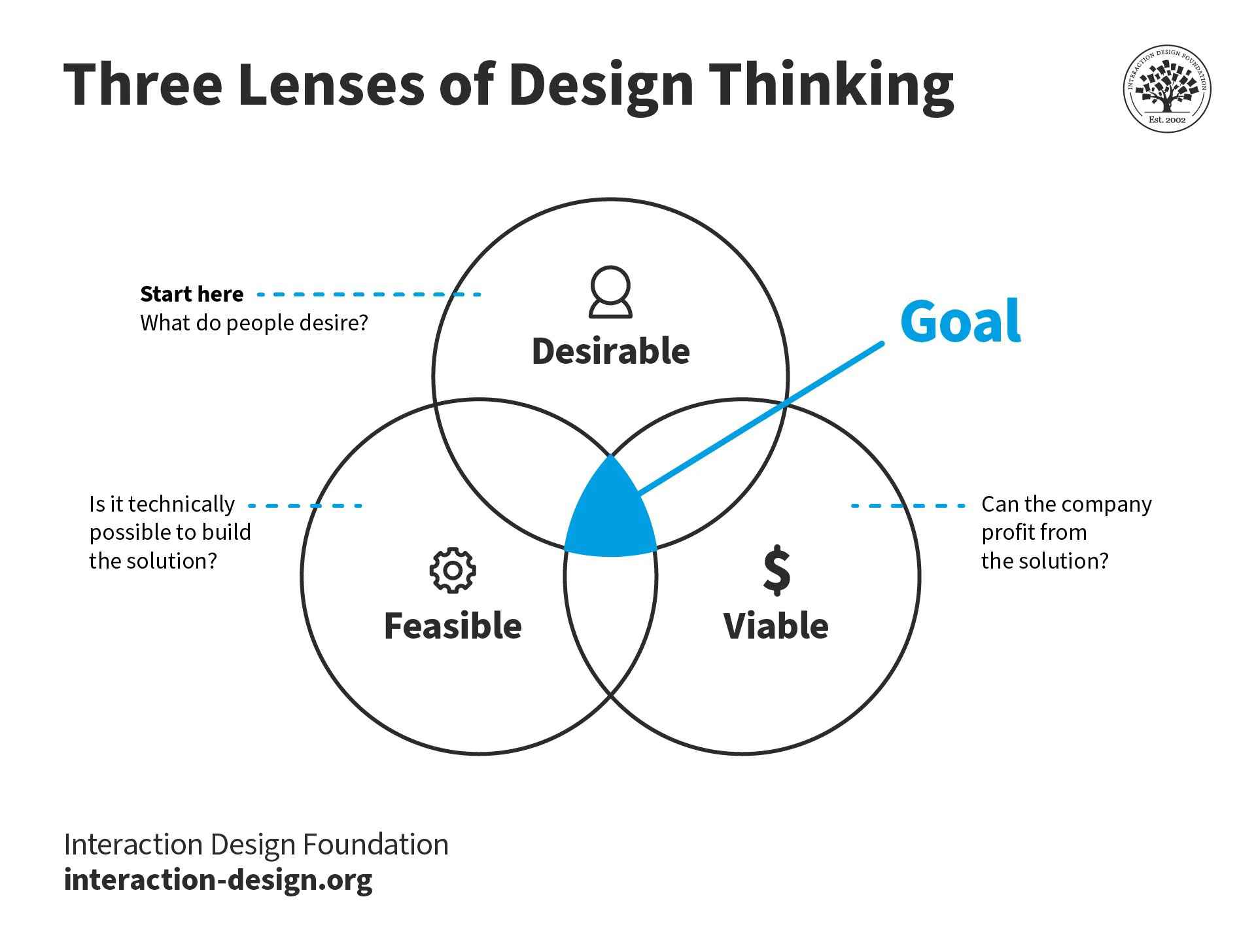
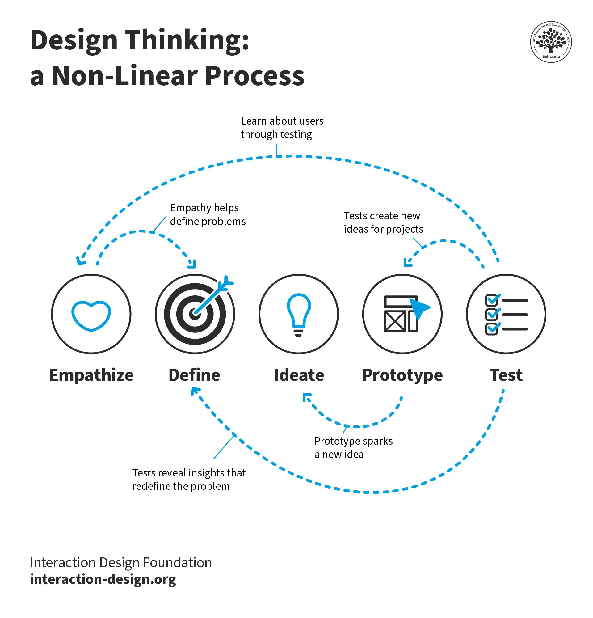
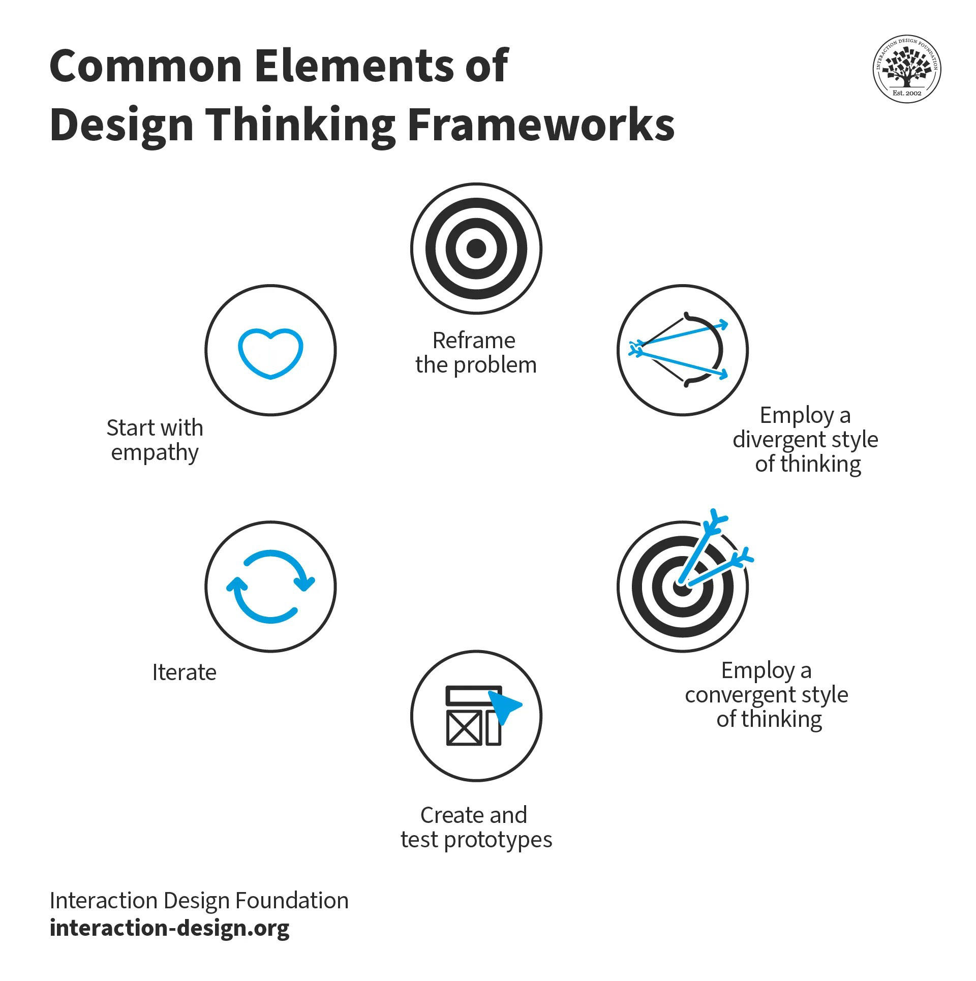
Research and Discovery:
I conducted a thorough analysis of Copart's classic car market, including user demographics, competitors' landing pages, and industry trends. User focus groups and surveys provided valuable insights into users' pain points and preferences.
During the analysis, we identified a critical issue: two different buttons existed for the same segment, resulting in data being divided across these buttons. This discovery prompted us to consolidate the data accurately and ensure a unified approach to tracking user interactions.
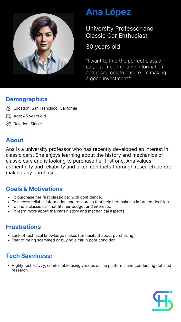
Moreover, through our research, we successfully pinpointed our top customer segment, gaining a profound understanding of their needs and expectations. Armed with this knowledge, we started structuring the new design to cater to this key segment, optimizing the overall user experience.
As a result of our comprehensive research and the actionable insights gained, we developed a well-structured and targeted design, to address the needs of our top customer segment effectively.
User Personas and User Journey
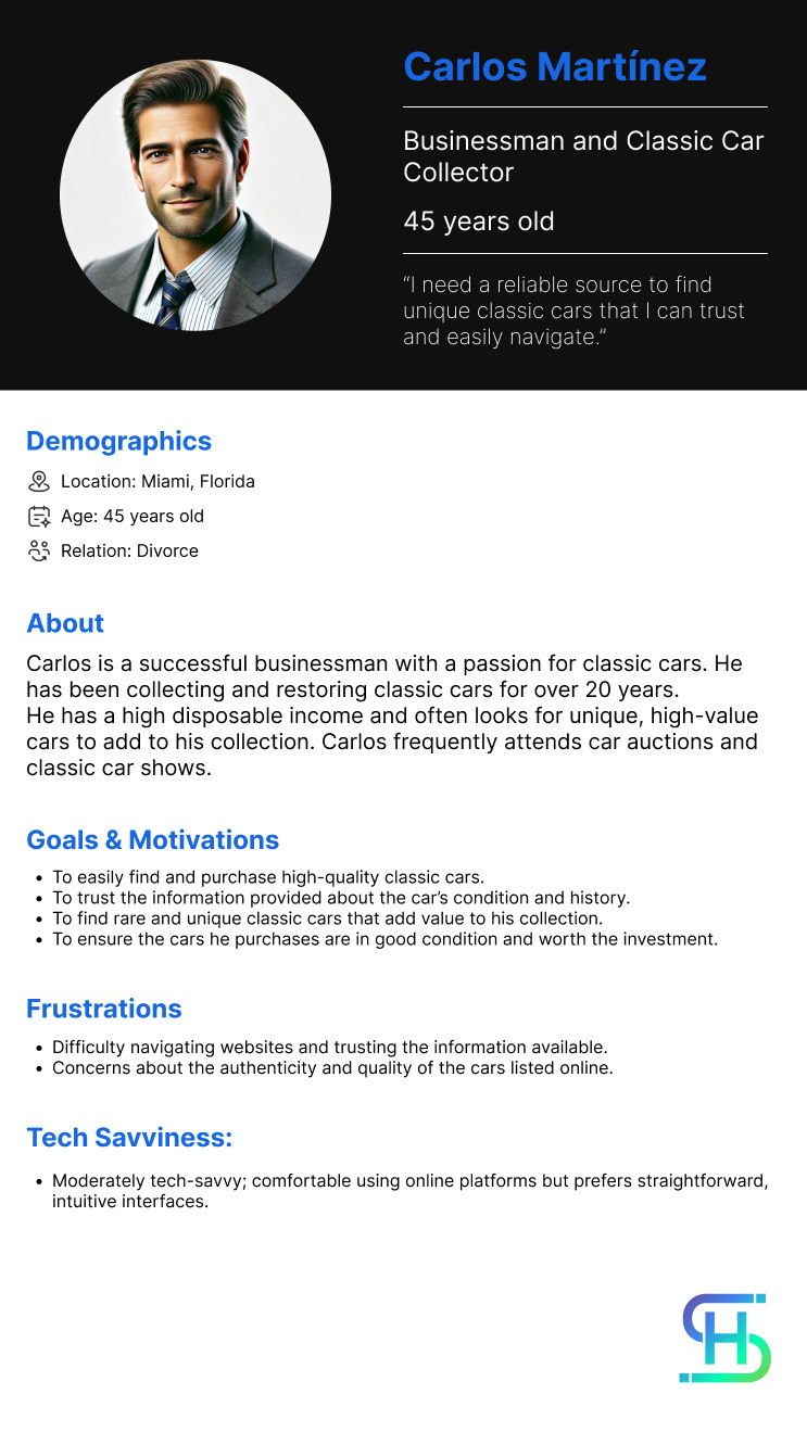
Customer Journey
Analytics
Define
This information helps me to decide that the majority of the customers enter the page to see the auction now. The 1960s-1970s is the second most searched on this page. The third most searched button on this page is the 1920s-1930s. With the 3.0 Copart Design Style images and buttons are more prominent and bigger.
Ideation and Conceptualization:
I decided to have one button at the top that said: "Auction Now" and the second one for "Register Now". If the customer wants to go to "Auction Now" is going to be at the top and the other user personas want to learn more about the Classic Cars process they can continue with the informative part of the page. I decided to create 3 Key features for the Copart Auction process and made a better and updated years range gallery. I included a section for a video for Copart Classic explaining the process. Then we included the membership prices, and a learn more section, and also tried to attract the pain points for the customer when they subscribe.
Based on research findings, I devised a design strategy to target the following objectives:
- Create a modern and visually appealing landing page that aligns with the brand identity.
- Simplify the user journey by reorganizing the page's content and navigation elements.
- Optimize the page for SEO by incorporating relevant keywords and metadata.
Information Architecture:
To enhance user experience, I restructured the landing page, adopting a user-centered approach. Key changes included:
- A prominent search bar for users to quickly find classic cars by make, model, and year.
- Clear call-to-action buttons to encourage users to explore inventory and participate in auctions.
- Organized sections with visually enticing car images and brief descriptions.
Visual Design:
In the visual design phase, I leveraged Copart's brand guidelines while adding modern touches. Key design elements included:
- A visually striking hero section featuring a selected premium classic car.
- A cohesive color scheme that complemented the classic car aesthetic and maintained brand consistency.
- Carefully chosen typography to enhance readability and evoke a sense of classic elegance.
Prototyping
Final Design
Results and Impact:
The redesigned Copart Classic Car Landing Page yielded significant results:
- 22% increase in organic traffic due to improved SEO efforts.
- 16% reduction in bounce rates, indicating improved user engagement.
- 31% increase in conversion rates, leading to a higher number of auction participants and potential buyers.
- 56% reduction in the volume of calls to Customer Service.
Reflection:
Reflection: This project highlighted the importance of comprehensive research and collaboration between design disciplines. By assuming multiple roles—researcher, information architect, and visual designer—I was able to address the project's challenges comprehensively and deliver a successful redesign.
Conclusion: The Copart Classic Car Landing Page redesign showcased the potential for user-centric design to enhance user experience, optimize SEO, and boost performance. By modernizing the page's aesthetics and structure, we successfully positioned Copart as a leader in the classic car market, attracting more visitors and generating increased user engagement.
Conclusion:
The Copart Classic Car Landing Page redesign showcased the potential for user-centric design to enhance user experience, optimize SEO, and boost performance. By modernizing the page's aesthetics and structure, we successfully positioned Copart as a leader in the classic car market, attracting more visitors and generating increased user engagement.
